Conceptual Exploration
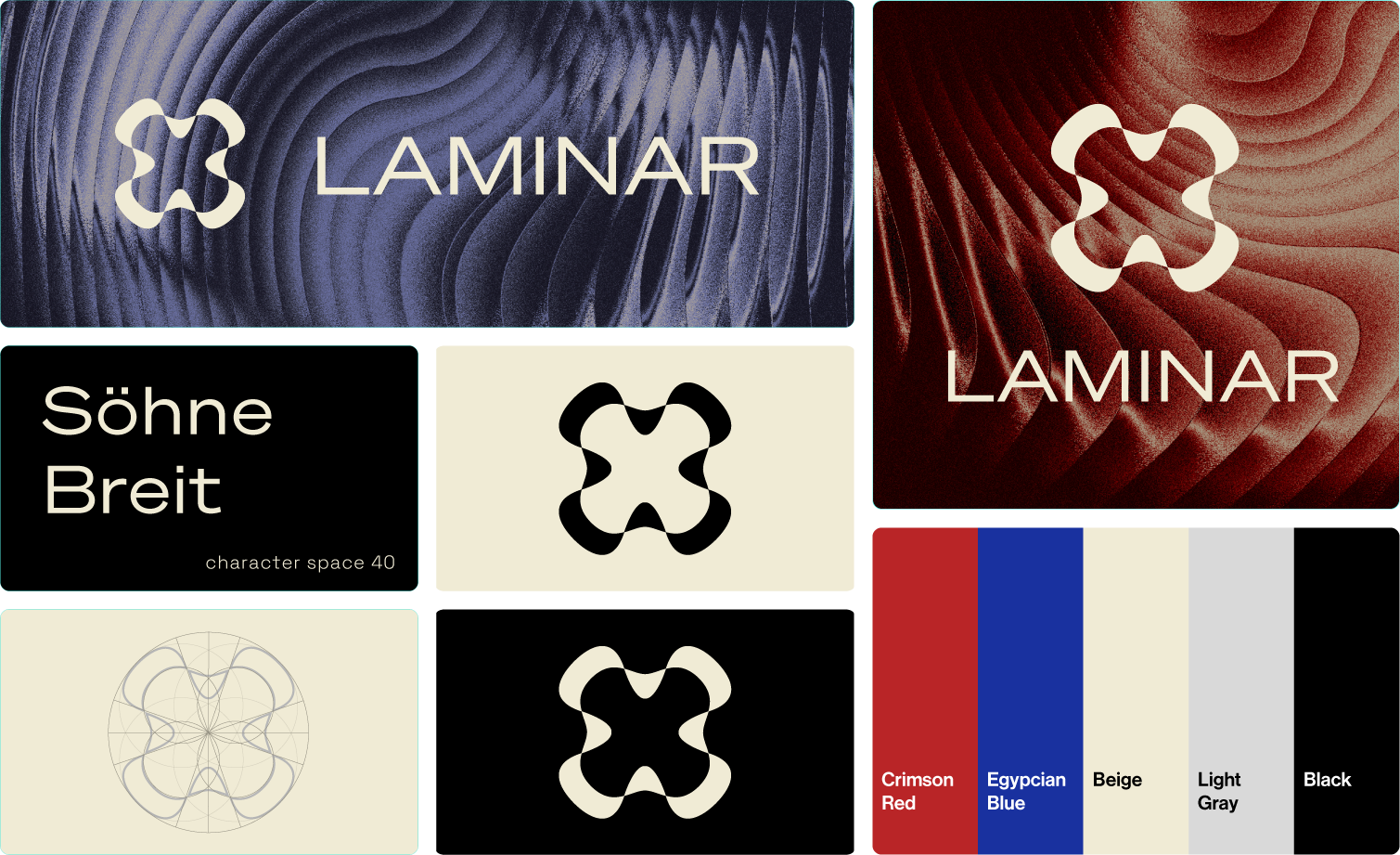
Initial form studies focused on capturing the essence of "laminar flow"—the smooth, layered movement found in fluid dynamics. The goal was to translate physics concepts into organic, sculptural shapes.

Visual Design System
The final identity features a custom logomark paired with the Söhne Breit typeface to balance structural precision with organic fluidity. The color palette contrasts deep crimson and Egyptian blue with neutral tones to evoke elegance and modernity.
Digital Presence & Social Strategy
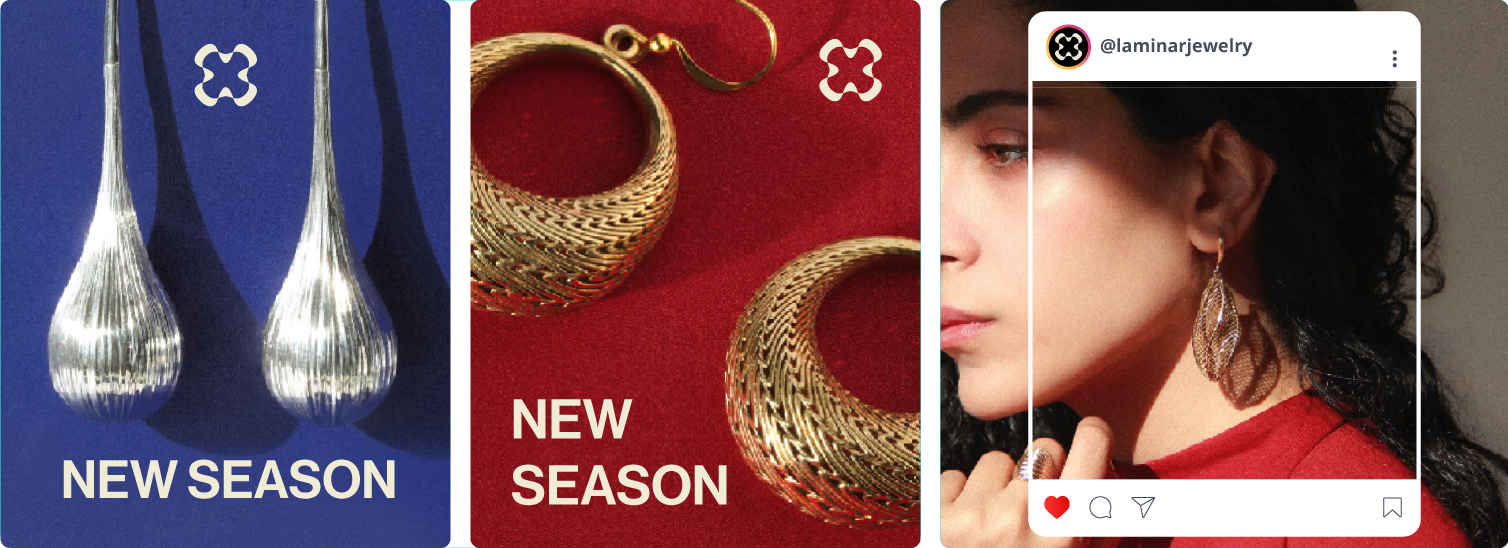
I designed a cohesive set of digital assets for social media platforms like Instagram. The layout strategy highlights the sculptural nature of the jewelry while ensuring consistent brand recognition across mobile interfaces.
Physical Touchpoints
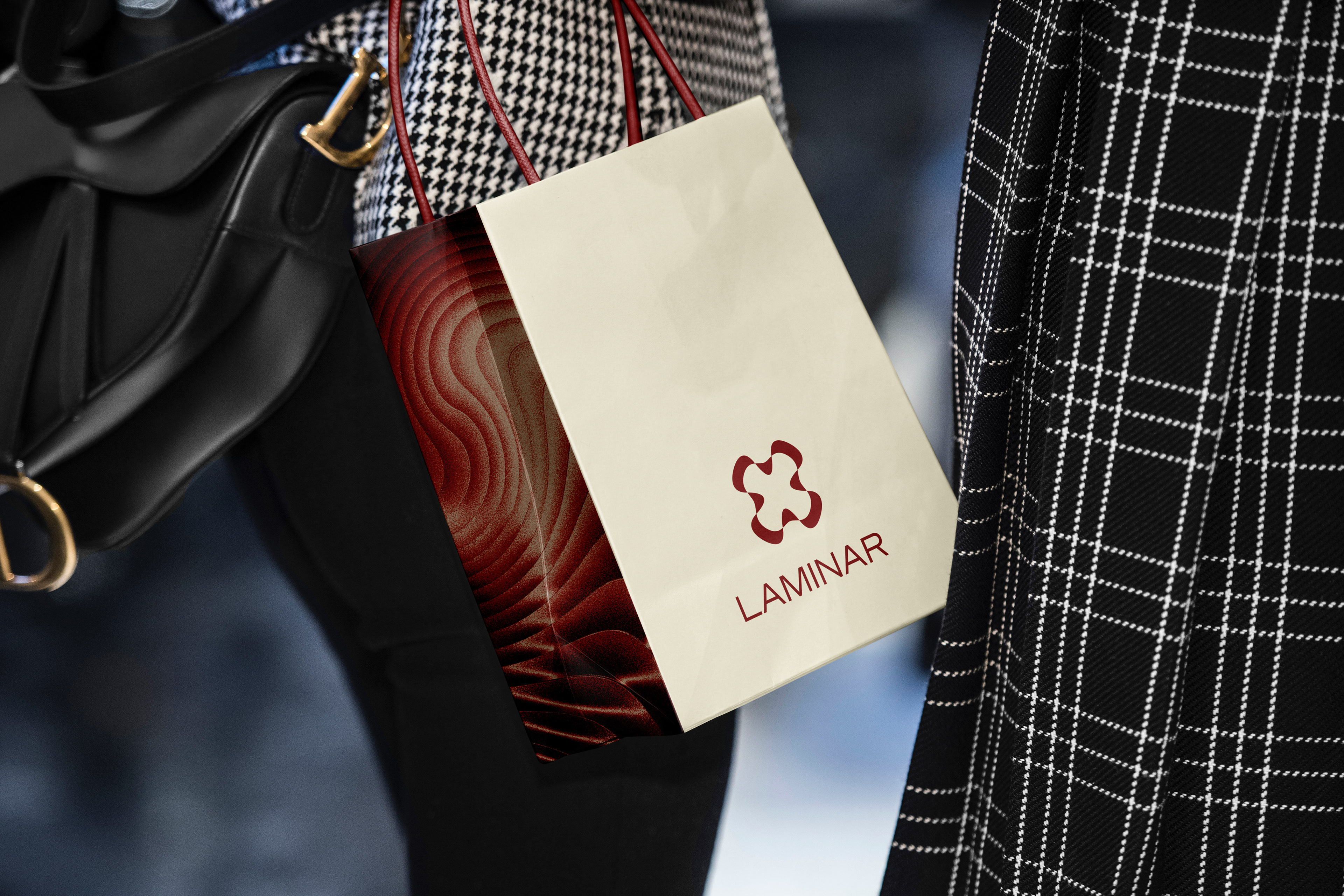
Extending the brand into the physical world, I designed the retail shopping bag to feature the signature wave texture. This ensures the customer journey remains immersive from purchase to unboxing.
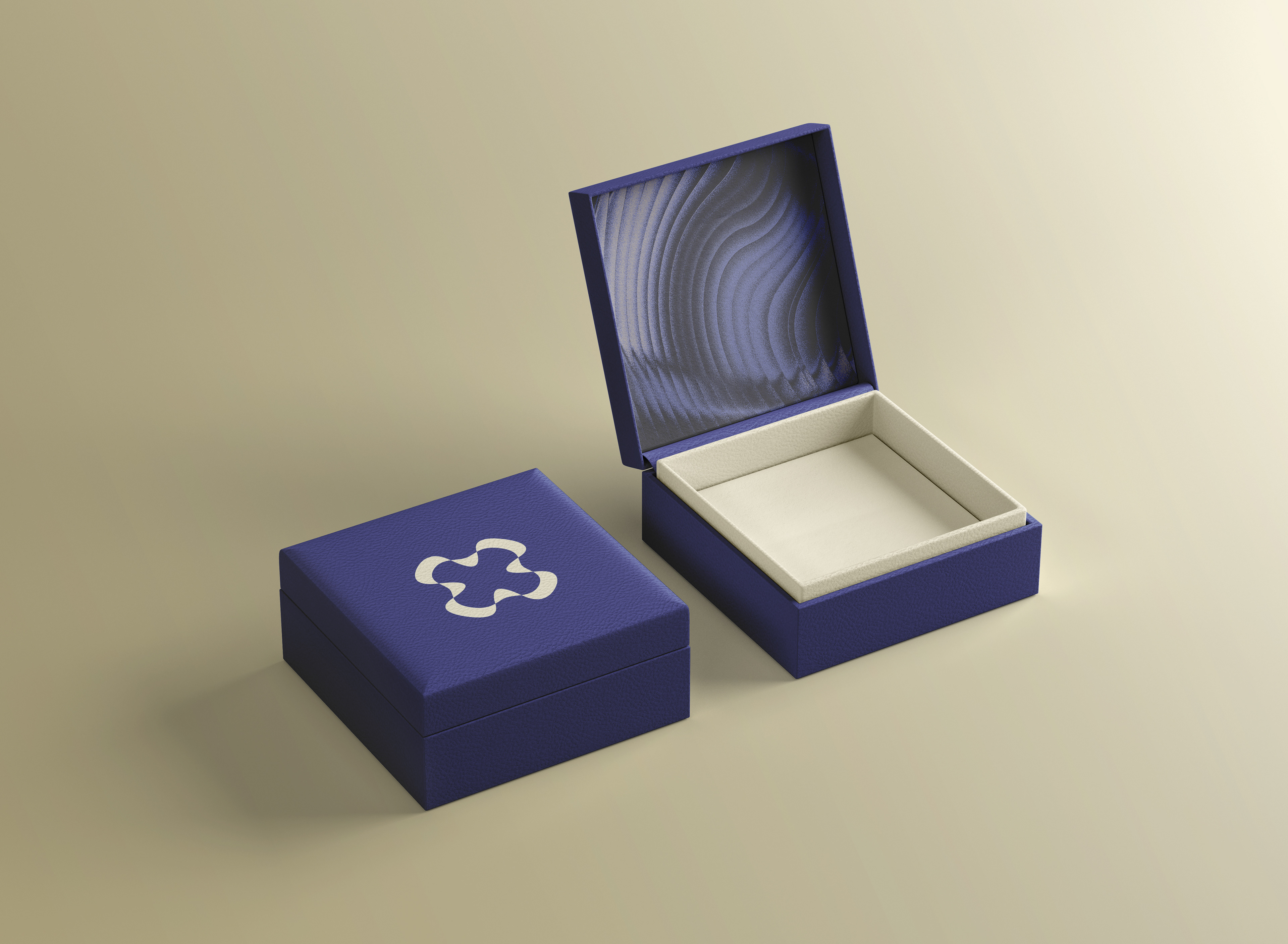
The Unboxing Experience
The premium jewelry box serves as the final anchor of the brand experience. The design prioritizes minimalism and texture, reinforcing Laminar’s core values of clarity and elegance.